What IS "Plein Air" painting?
"En Plein Air" is French, translating to "in the open air". ("Plein" rhymes with "pen".) It's used to describe a kind of painting done on location from life, as opposed to in a studio, from a photograph or some other reference. Painting en plein air presents multiple challenges, the greatest of which (for me) is trying to capture the essence of a scene before it changes. No small feat; especially here in Hawaii where we joke that if you don't like the weather, just wait 20 minutes. Factor in rain, wind, heat, and the logistics of lugging your painting supplies to the site, and you can see why plein air painting isn't for everybody. But I'm hooked, it's a sensory experience like no other, and takes me places I'd never have gone otherwise.
Painting the light, painting the dark
The goal of plein air painters is not so much to capture a scene, but to capture the light of a scene. A beautiful landscape is inspiring, but it's how the landscape is illuminated that truly inspires us to paint. Claude Monet painted the same hay stacks in a field over and over and over. He was fascinated with the changing light on the hay stacks, the way the atmosphere affected them. He painted at different times of day, in different weather conditions, and at different times of year. His subject matter remained the same, but he wasn't really painting the hay stacks, he was painting the light. So... how do you paint the light? By contrasting light colors with dark colors, and warm colors with cool colors.
LIGHTS & DARKS (VALUES). The basics. To paint what's light, start by painting what's dark. The contrasting dark makes the light look lighter. Think of how a tan makes your teeth look whiter. Plus there's a freebie, when you get your lights and darks in the right place, your subject matter completes itself. The lights and dark create form.
We're probably all familiar with the basic drawing lesson: draw a circle, you've got a circle. Fill it in, now you've got a flat dot. But fill it in darker on one side, graduating to lighter on the other, ahhh, now you've got a sphere, a 3D shape. Add a bit of dark shadow under that sphere, and the sphere is no longer floating, you've created the ground and the sphere is sitting on it. Lights and darks create form. Basic, but it works!
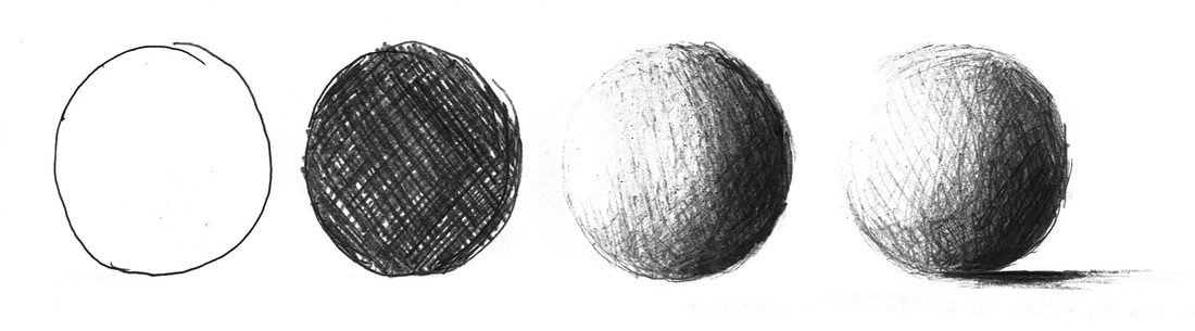
Plein air painting is simply an extension of that basic lesson. Break your subject matter down into big, simple shapes (spheres, cones, cubes), and think of each shape as having 3 tones (values), a light, a dark, and a mid-tone. The lightest area of your shape is where the sunlight hits directly, the darkest area is the deepest shadow (usually the opposite side from where the sun hits), the mid-tone is everything in between. No matter what color you use, if you remember the relationship between the values (your lights and darks), it works. When your lights and darks are in place, the subject has form.
Now be quick, before the sun moves! A sphere in the morning will be lit exactly opposite of the same sphere in the afternoon. When you're painting in natural light, you've got about 2 hours to get it done. I sometimes take a photo of the scene when the light is just as I want it, so I can refer back to it. Or I visit the same scene again at that time on a different day (and hope for similar weather conditions) to complete my painting.
Now be quick, before the sun moves! A sphere in the morning will be lit exactly opposite of the same sphere in the afternoon. When you're painting in natural light, you've got about 2 hours to get it done. I sometimes take a photo of the scene when the light is just as I want it, so I can refer back to it. Or I visit the same scene again at that time on a different day (and hope for similar weather conditions) to complete my painting.
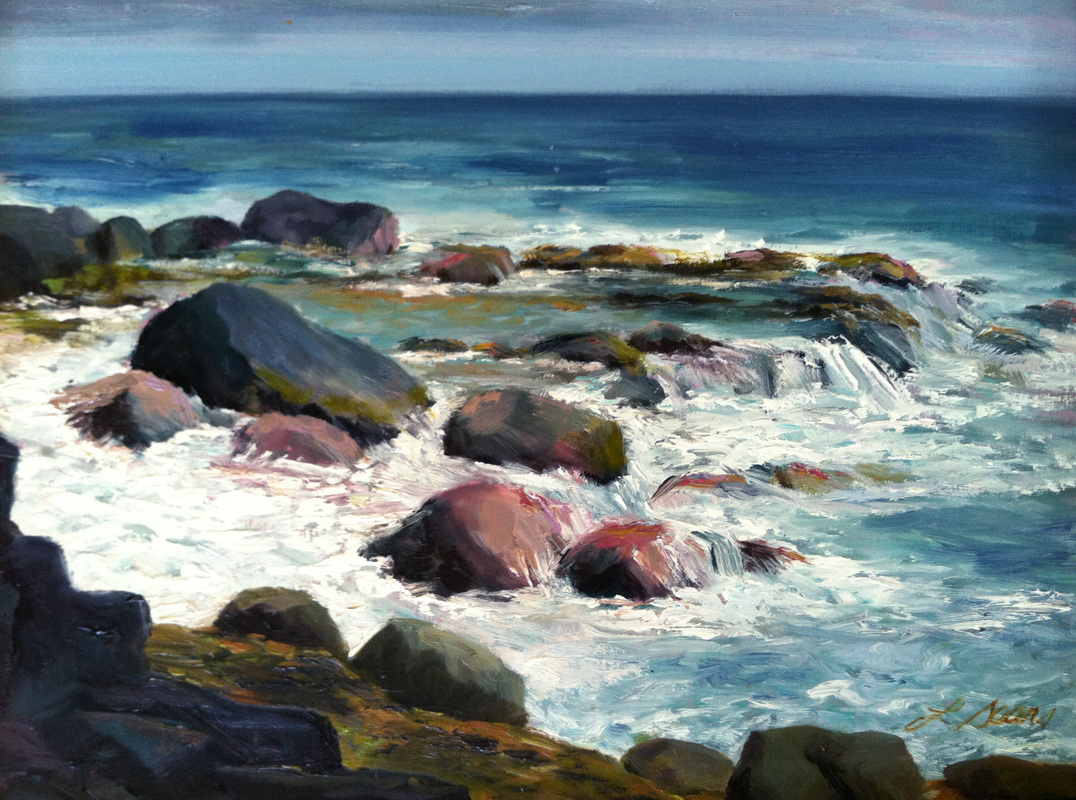
In this seascape, the shape of the rocks are all essentially spheres, albeit non-uniform. They're lit from the upper right, and it was a bright sunny afternoon, so I used more pinks and warm golds on the rocks than were really there to play up the heat of the sun.
|
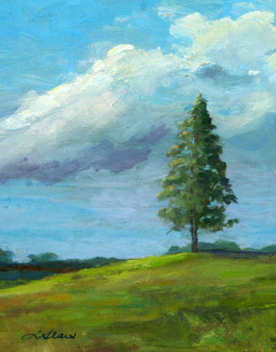
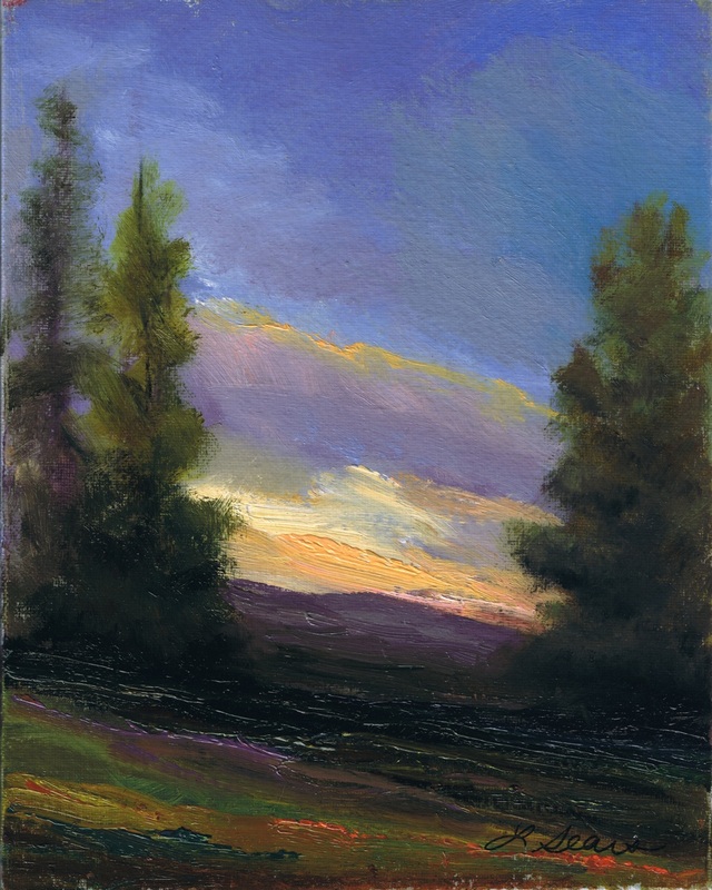
Here, the main subject, the tree, is a cone shape. It's early morning, the sun was low in the sky, coming from the left. The shadow on the ground helps "plant" the tree.
|
Using color to create temperature
Lights and darks are the bones of a painting, color is what brings it to life. But think beyond the "standard" colors you learned when you were young, like the sky is blue and grass is green; that's all pretty boring in a painting. Besides, while the sky may be blue and grass is generally green, look a little deeper, you'll see a whole lot more. When you're painting, exaggerate what you see. Variation in both color and brush work is a lot more interesting to look at, even if it's not totally accurate. You're not trying to produce a perfect rendering (if you are, take a photograph), you're trying to create a beautiful painting.
WARMS & COOLS. In addition to thinking about lights and darks, warm colors and cool colors also create the feeling of light and shadow. Just like in nature, it's warm in the sun, and cool in the shade; by painting with those colors you create the feeling of the temperature of the day. Obvious warm colors are reds, oranges, and yellows. Obvious cools are blues, greens and purples. A highlight painted with light golden yellows (or pinks) conveys warmth; throw some blue or purple in your shadows to create the feeling of coolness. In my tree painting above, instead of just making the side in the sun be light green, and the side in shadow be dark green, I used warm and cool colors to push the point. Light and dark greens would have created the form well enough, but been less interesting to look at.
Just as putting a dark color next to a light one makes the light look lighter (tan/teeth), putting a warm color next to a cool one makes the cool look cooler. And vice-versa. It's in the contrast, and that contrast is what gives a painting sparkle.
Creating depth
Painting the light also involves painting the atmosphere, capturing a sense of space and distance. Your canvas is flat, the world is three dimensional. How do you create the feeling of depth? How do you push those distant mountains into the distance? There are a couple of simple tricks. As things move away, they become less focused: edges get softer, contrasts lessen, colors become muted. And things get more blue! It's because you're viewing distant objects through the atmosphere, which has a color of its own. The sky between you and your subject acts like a filter, usually a soft, light, purply-blue filter, and you're looking through it. The fastest way to create the illusion of depth is to use muted blue/purple/grays on distant objects. The farther away something is, the more blue/purple/gray it is, the softer it is. Even if you don't see it that way, paint it that way, it makes your painting more convincing.
But what's the point?
Good... point. For a painting to hold a viewer's attention, there needs to be a focal point. A main area of interest. If your whole painting is ablaze in lights and darks and warms and cools, a viewer can't make sense of it. The eye doesn't know where to linger, and so it doesn't. A painting needs a focal point to be powerful. It needs an area where the contrast is stronger than anywhere else. Establish the focal point by using sharp edges and high contrast; everything else in your painting should be a bit softer and more muted. Oh, and avoid putting your focal point smack dab in the center of your paint. Books have been written on composition alone so I'll spare you, but for a strong composition avoid placing the focal point (or horizon line) right in the middle.
Lights & darks create sunlight and shadow, warms & cools create temperature, atmosphere is created by depth. A good focal point adds interest. Those are the ingredients of a strong plein air painting. But most of the time when I paint, I'm just appreciating the beautiful a place I'm in, and loving the pretty colors!
Lights & darks create sunlight and shadow, warms & cools create temperature, atmosphere is created by depth. A good focal point adds interest. Those are the ingredients of a strong plein air painting. But most of the time when I paint, I'm just appreciating the beautiful a place I'm in, and loving the pretty colors!
Painting for the beauty of it
The techniques I've described are the components of painting en plein air. But most of the time when I'm painting I'm not thinking about lights/darks, warms/cools. I'm simply struck by the beauty of a scene. While the dramatic light and shadow of early morning and late afternoon make excellent painting material, I'm most attracted to the soft colors of dusk, and the amazing pinks of sunsets. Dawn can be pretty stunning too, but it's harder to be at a paint site in time to catch a sunrise. My favorite time to paint is the lavender hour, the last hour or so before sunset. The sun is fading, the bright light and high contrasts are gone, the landscape is blushing. It's time to let go of the light/dark, warm/cool lessons, and enjoy the color. It's just plain pretty. (My secret weapons: Quinacridone Red and a cup of merlot.)
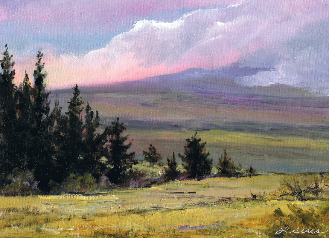
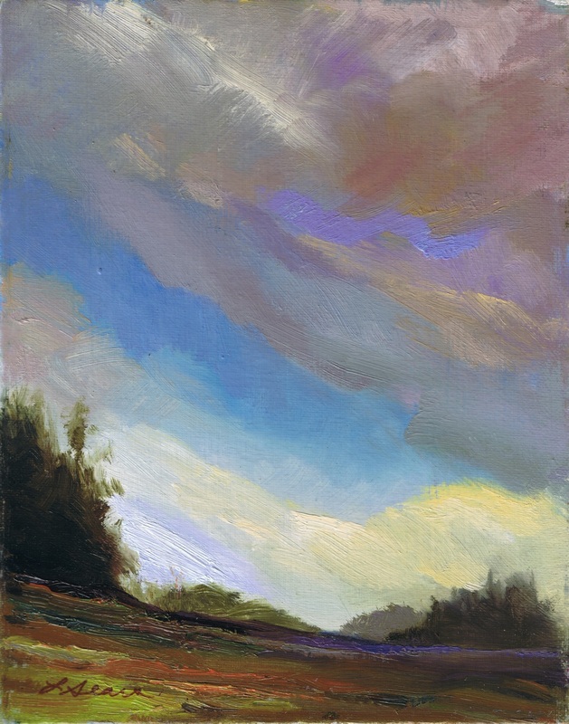
This was painted near the top of the Saddle Road, which runs from Hilo to Kona, between the volcanic mountains Mauna Kea, Mauna Loa, and Hualalai. At 6000' the air is thin & cool, the vegetation is totally different than at sea level. The lavender hour is almost always spectacualr.
Plein air's magic moments
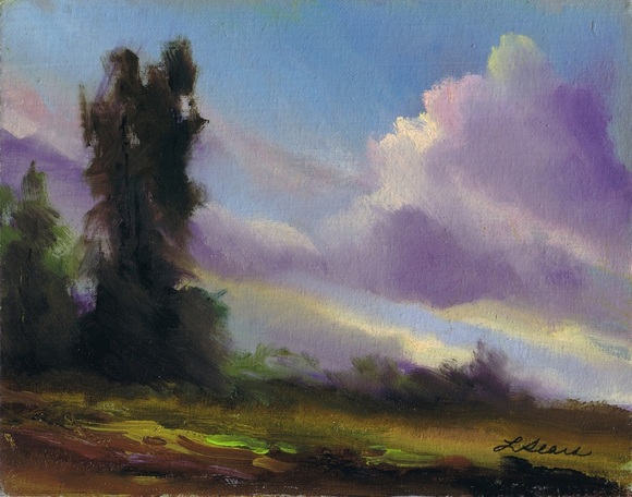
Plein air painting presents some interesting challenges, and some great surprises. These are 3 paintings I did in Idaho, at a 5 day still-life workshop. I know, I know, these are not still-lifes. Still-life is not my thing, EVER, and to make it more...interesting...this was an OUTDOOR still-life workshop, Still-life En Plein Air. I generally choked at the workshop, but there were a few lovely moments. These paintings happened at the end of an especially frustrating day. I had been repeatedly slaughtering the same vase of roses FOR THREE DAYS, and on this day, it was 44 degrees and raining. Not wanting to be a quitter, I'd stuck it out, freezing, but I was desperately wishing it would all be over so I could get in my rental car and turn on the heater and maybe feel my fingers again. It was finally time to pack up, when I looked over my shoulder, across a field, to this view! I spun around and did all of these sunset paintings in about 30 minutes flat–which was all the time I had before it was dark. My still-life paintings were a total flop, but I went away satisfied that day. And took a really hot shower.
|
|